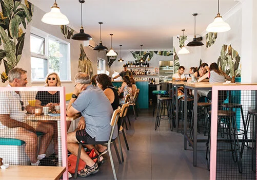
Suburbia Restaurant
Bringing Venice Beach and Santa Monica-style vibes to the heart of Manly, Suburbia was born of the vision that the Northern Beaches needed decent fried chicken.
It bought that, along with bright pops of colour and a playful sense of fun.

Branding, Materials, Signage, Stationery, Uniforms, Website
Chosen Concept: A bold colour palette, emphasising the chicken and all being ‘A-OK’. A nod to the vibe Suburbia aims to provide. Highlighting ‘sub’ (under) by dropping the letterforms slightly lower than the rest, and utilising the chickens beak within the logo mark itself.

Image Credits - Leticia Almeida, Broadsheet


